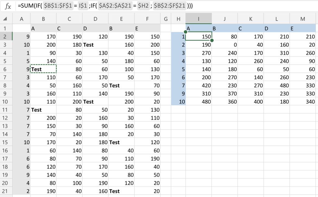
Excel for Business
How to Sort Data Horizontally in Excel

Sorting data in Excel is one of the most fundamental tasks for data analysts and business owners. While most are accustomed to the default vertical sorting, sometimes there’s a need to reorganize data horizontally. Whether it’s for comparing monthly sales, displaying rankings across columns, or custom analyses, horizontal sorting can provide clarity and precision.
This post breaks down the exact ways to sort data horizontally in Excel, step by step. By the end, you’ll be equipped with several actionable methods to streamline your workflow.
Understanding the Challenge
Standard Excel functionality focuses primarily on vertical sorting, where data is ordered top-to-bottom within a column. While this is effective in many scenarios, it falls short when you need to reorder data side-by-side along rows in a table.
For instance, if you’re comparing product sales across several months and need to rank them from highest to lowest horizontally, vertical sorting just won’t cut it. That’s where horizontal sorting comes into play.
Here are four methods to sort data horizontally, covering everything from basic functions to advanced VBA scripts.
Techniques for Sorting Data Horizontally
1. Using the TRANSPOSE Function
The TRANSPOSE function allows you to flip a range of data from vertical to horizontal (and vice versa). It’s a quick way to prepare data for horizontal sorting.
Steps to use TRANSPOSE for horizontal sorting:
- Select the data range intended for sorting (e.g., products and sales figures listed vertically).
- Copy the data (Ctrl+C or Cmd+C) and Paste Special into an empty area of the sheet. Choose “Transpose” in the Paste Special menu to convert the data from vertical to horizontal.
- Apply Excel’s default sort feature to reorder the data horizontally.
- Use the TRANSPOSE function again if necessary to return the rearranged horizontal data back into its original vertical format.
Limitations and tips:
- If your dataset includes formulas, TRANSPOSE may not work seamlessly. Be prepared to adjust the formulas manually.
- Always create a duplicate of your data before performing transformations to avoid losing valuable information.
2. Pivot Tables for Horizontal Sorting
Pivot Tables are invaluable in Excel for organizing and analyzing large datasets. While they’re commonly used for summarizing data vertically, they can also support horizontal sorting.
Steps to create a Pivot Table for horizontal sorting:
- Select your dataset and go to Insert > Pivot Table.
- Drag the category or labels you want to sort into the Columns area of the Pivot Table.
- Place numerical data (e.g., sales figures) into the Filter or Value area.
- Use the sort option within Pivot Tables, choosing ascending or descending order.
Why Pivot Tables work:
- They allow for complete customization of data views.
- You can filter and group data while pivoting rows to columns for horizontal arrangement.
3. The Power of INDEX and MATCH
The INDEX and MATCH functions are staples in Excel for locating and rearranging data. Together, they create a flexible system for sorting horizontally.
Using INDEX and MATCH for horizontal sorting:
- Write an INDEX formula to pull specific row information based on criteria.
Example formula:
=INDEX(SalesData, 1, MATCH(LargestValue, SalesDataRow, 0))
- Combine INDEX with MATCH to dynamically reorder row data into a new order horizontally.
Practical example:
Suppose you want to rank monthly sales across columns horizontally. Use MATCH to find the corresponding values in descending order and INDEX to reorganize the row data.
Best practices:
- Use a helper row when sorting multiple rows of data horizontally.
- Lock the cell references with absolute references to maintain accuracy when copying formulas across cells.
4. VBA Scripts for Advanced Horizontal Sorting
For advanced users, VBA (Visual Basic for Applications) scripting takes horizontal sorting to the next level. It automates repetitive sorting tasks and offers flexibility that traditional Excel features may lack.
Sample VBA script for horizontal sorting:
- Press `Alt + F11` to open the VBA editor.
- Select Insert > Module to create a new module.
- Paste this code into the module:
“`
Sub HorizontalSort()
Dim rng As Range
Set rng = Selection
rng.Sort Key1:=rng.Rows(1), Order1:=xlAscending, Orientation:=xlSortRows
End Sub
- Close the VBA editor and return to your worksheet. Select the range of data you wish to sort horizontally, then run the macro (Alt + F8).
Key benefits of VBA scripts:
- Automates repetitive sorting tasks, saving time.
- Handles large datasets without manual intervention.
Word of caution:
- Test VBA scripts on backup copies of your data to ensure no unintended changes occur.
Putting It All Together
Sorting data horizontally in Excel might seem daunting at first, but these techniques simplify the process. Each method—from basic TRANSPOSE functions to advanced VBA scripting—caters to different levels of expertise and types of data.
When deciding which technique to use, consider the complexity of your dataset and the frequency of sorting required. For quick solutions, TRANSPOSE and INDEX/MATCH work wonders. For routine or large-scale tasks, Pivot Tables and VBA scripts ensure efficiency and accuracy.
Excel’s versatility allows for customization, so don’t hesitate to experiment until you find the workflow that best suits your needs. And remember, even small improvements in data organization can lead to smarter decisions and more impactful analysis.
If you found these tips helpful, explore more Excel how-tos and shortcuts on our blog! Subscribe to receive regular updates and unlock the full potential of Excel in your professional life.
Meta data
Meta title
How to Sort Data Horizontally in Excel
Meta description
Learn 4 expert methods to sort data horizontally in Excel, including TRANSPOSE, Pivot Tables, INDEX/MATCH, and VBA scripting. Streamline your workflow today!


Microsoft Excel is more than just a spreadsheet tool; it is a powerful platform for building customized calculators that can make your daily tasks easier and more efficient. Whether you want to track your monthly budget, calculate business expenses, estimate project costs, or analyze performance metrics, Excel gives you all the flexibility you need. With simple formulas, data validation, and conditional formatting, you can turn plain tables into interactive tools that save time and reduce human error. Once you learn a few basic functions, you will be able to design calculators tailored to your workflow and simplify complex calculations with ease.
Understanding the Basics of Excel Formulas
Excel formulas are the foundation of any calculator you create in the program. They allow you to perform mathematical operations, analyze data, and automate repetitive tasks. The most common formulas include SUM, AVERAGE, MIN, MAX, and IF, which help you calculate totals, averages, and conditional results. For example, =SUM(B2:B10) quickly adds all numbers in that range, while =IF(A1>100,”Yes”,”No”) lets Excel make decisions based on data. You can also combine multiple functions for more advanced results, such as =AVERAGEIF() or =SUMPRODUCT(). Once you understand how to use cell references, parentheses, and operators like +, -, *, and /, you can build powerful formulas that process information automatically. Learning these basics is the first step to turning Excel from a simple spreadsheet into a dynamic calculator that saves time and boosts productivity.
Using Percentages and Conditional Formatting for Smarter Insights
Percentages and conditional formatting are powerful tools in Excel that help you visualize and analyze data effectively. By combining these features, you can transform plain numbers into meaningful insights. For example, you can calculate what percentage of your budget is spent on different categories or track progress toward a financial goal. Conditional formatting lets you highlight cells automatically based on specific rules, such as marking values above 80% in green or below 50% in red. This makes trends and potential issues easy to spot at a glance. The same approach can be used in various contexts, including research and health tracking tools like a peptide dosage calculator, where percentage-based calculations help ensure precise and consistent measurements. Mastering these functions allows you to make data-driven decisions faster and more accurately while keeping your spreadsheets visually clear and informative.
Automating Calculations with Built-In Excel Functions
Excel’s built-in functions allow you to automate calculations and reduce manual work. Instead of entering numbers and formulas repeatedly, you can use functions like SUM, AVERAGE, IF, and VLOOKUP to perform tasks instantly. For example, =SUM(B2:B20) adds all values in a range, while =IF(A2>100,”High”,”Low”) categorizes data automatically. More advanced tools like XLOOKUP, INDEX, and MATCH help you pull specific data from large tables with ease. You can also use date and time functions such as TODAY() or NOW() to update information automatically. This approach is especially useful when creating dynamic reports, expense trackers, or dosage estimators that need to update regularly. By learning how to use these built-in features, you can transform Excel into a smart system that calculates, updates, and analyzes data on its own—saving you hours of repetitive work and improving accuracy in every project.
Tips for Designing User-Friendly Excel Calculators
Designing a user-friendly Excel calculator means creating a tool that is easy to navigate, visually clear, and efficient. Start by organizing your layout so inputs, outputs, and results are clearly separated. Use consistent colors, bold headers, and cell borders to make key sections stand out. Data validation helps prevent errors by limiting what users can enter into specific cells, while drop-down menus can simplify complex choices. Always label your inputs clearly, for example, “Enter Amount” or “Select Percentage,” so users know exactly what to do. Adding brief notes or instructions can make your calculator even more intuitive. You can also use conditional formatting to highlight results automatically when certain conditions are met. For example, values above a target can turn green, and those below can appear red. A well-structured and visually appealing calculator makes Excel not only functional but enjoyable to use for budgeting, planning, or professional data analysis.
Conclusion
Creating calculators in Microsoft Excel is a practical way to simplify your daily work and improve efficiency. Whether you use it for budgeting, tracking expenses, or managing data, Excel gives you the flexibility to design tools that fit your specific needs. By combining simple formulas, clear layouts, and basic automation, you can save time and minimize errors in your calculations. Once you understand how to organize your data and apply the right functions, you will see how powerful Excel can be. It is not just a spreadsheet tool but a smart solution for turning numbers into insights.

Slicers is a very useful but underutilized tool in Excel. You can dynamically filter your pivot tables and pivot charts with animated buttons, aka slicers. For more information on slicers, you can check this short article.
Now let’s see how to build an Interactive Excel KPI Dashboard using pivot table tools:
I prepared a summary data for 4 departments; welding, cutting, assembly and packing. KPI’s for these 4 departments are selected as efficiency, productivity and scrap rate. Data set includes values for 12 months (4x3x12=144 rows). Here is how data set looks:
Select all the data and insert a pivot table. Arrange fields as shown below (Don’t look for Rest field at this point. We are going to add it in next step):
Click on the pivot table to activate it and add a calculated field from the menu shown below:
Set calculated field parameters as shown below and we will have an additional field in our pivot table to use for our charting needs:
Set KPI filter as “Productivity” and make 2 copies of the pivot table (by copy and paste). Set KPI filter for those tables as “Efficiency” and “Scrap Rate”. Here is how it is supposed to look:
Insert a donut chart for each of these pivot tables. Cut them and paste them to another sheet. Format your charts to look like this:
To do this, right-click on any gray button on the chart and select “Hide All Field Buttons on the Chart”. Delete chart title and legend. Then click on the donut and set shape outline to “No Fill”. Set shape color separately by clicking on them and selecting color.
Now make another copy of the first chart and arrange fields as shown below:
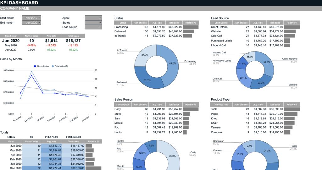
When finished, make 2 copies of this pivot chart too:
Now merge 3 cells and type “=B5” (without bracelets). B5 is the cell that contains result value of first pivot table (you can see from previous picture). Make sure to disable gridlines here. Then select your merged cell and copy it. Then paste it, as linked picture, to the sheet that has your donut charts. And drag it over related chart.
We are finished our donut charts at this point. It is time for our column charts. We need a 3 column data table for each of our column charts. Here is how I do it:
Place a 3 column grid just under the second set of pivot tables. First row will contain column titles. First column will contain month names. Remaining 2 columns will be filled by formulas. Here are the formulas:
Result Column Formula:
=SUMIFS(Sheet1!$E:$E;Sheet1!$A:$A;Sheet2!$A$14;Sheet1!$B:$B;Sheet2!$B$11;Sheet1!$D:$D;Sheet2!$A20)
This formula fetches result values based on department and KPI values selected on the pivot table above and month name in first column. You can see how to use this function from here SUMIFS FUNCTION.
Selection Column Formula:
=IF(A20=$A$15;B20;NA())
This formula checks selected month on the pivot table above and shows result value from 2nd column if month matches. If it doesn’t match, it shows #N/A.
Here are the tables I prepared:
Now select first table and insert a column chart. For formatting:
- Double-click on the orange column and set is as secondary axis.
- Set Series Overlap and Gap Width to 100%
- Delete both axes, chart title, legend and grid lines.
- Change column colors and set Shape Outline for the chart as “No Fill”
Here is how your chart should look like after all these make-up:
Do the same for other tables (other KPI’s), you can also copy chart formatting to do this faster. Then place these chart next to your donut charts:
Now comes the interactivity part. Click on your first donut chart and insert a slicer from INSERT ribbon. Select Month Name as field. Make sure settings are made as shown below:
You should check whether your slicer works correctly, by clicking on its buttons. If it doesn’t change charts, it is most likely because of report connections. You can correct this issue from there. Insert slicer for other KPI’s (chart pairs) too.
Now customize you slicers as a 3×4 button grid with button height and width as 1,2cmx1,2cm. Change colors to match with your charts. You can see how to do this from Customize Slicers. Here is how it should look like:
Add a final slicer for departments. You can do this by clicking on any of the charts and inserting a slicer. This slicer must be connected to all pivot tables.
Place it on top of your charts, add KPI texts over slicers and our dashboard is done.
Data visualization is a powerful way to uncover patterns, make data-driven decisions, and communicate insights effectively. One lesser-known but highly effective chart that can transform your data’s visual appeal is the butterfly chart. If you’ve never heard of it, you’re missing out on a handy tool that can bring clarity and precision to your analysis.
This blog will unpack the beauty behind butterfly charts in Excel, explain how you can create one step by step, and share tips to make yours stand out. Whether you’re a seasoned data analyst or an Excel enthusiast, you’re sure to discover something valuable here.
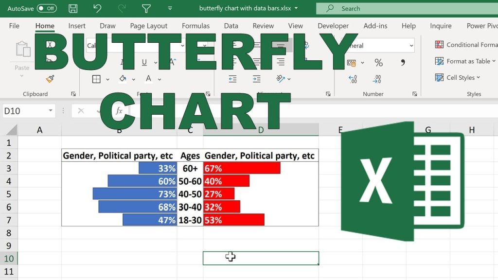
Understanding the Butterfly Chart in Excel
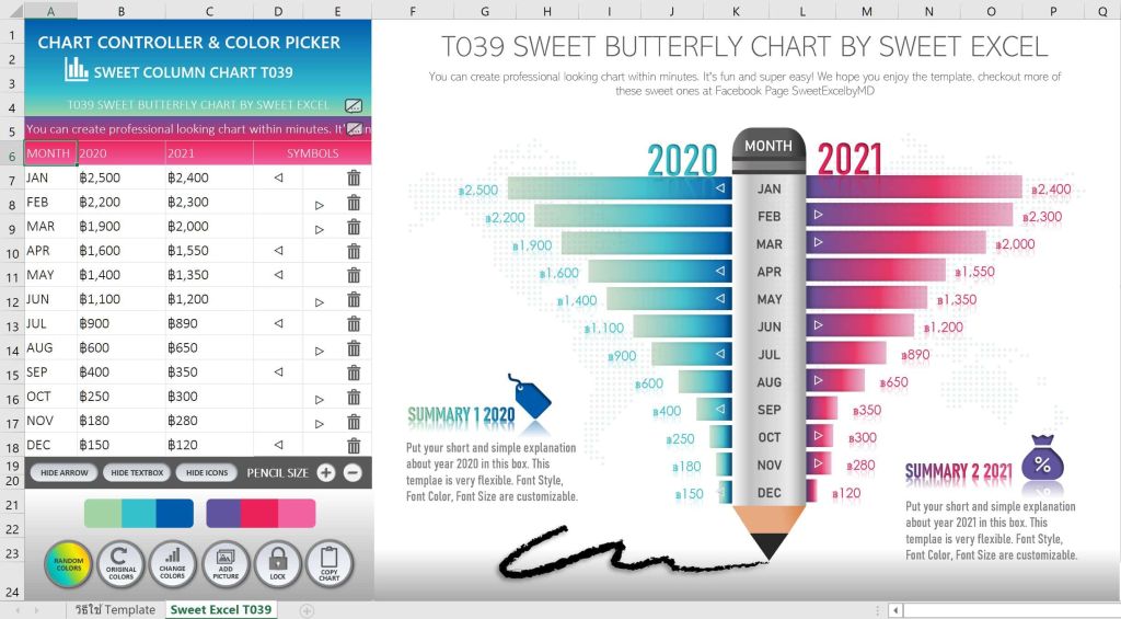
A butterfly chart is also called a tornado chart due to its distinctive layout. It’s essentially a dual bar chart with two sets of data mirrored against each other, resembling butterfly wings. This makes it an excellent choice for comparing two variables side by side.
For instance, butterfly charts can be used to compare male versus female population data or visualize two departments’ performance metrics. They bring out contrasts clearly and help audiences grasp data relationships at a glance.
Beyond aesthetics, their practicality in analysis and reporting has made butterfly charts a preferred choice for many data professionals.
Why Use Butterfly Charts
Butterfly charts aren’t widely used, but their utility is undeniable.
- Side-by-Side Comparison
They offer an intuitive way to compare data variables (like percentages or absolute values), making disparities or alignment between two groups instantly visible.
- Clear Data Communication
They simplify complex data, ensuring any audience—be it executives or team members—can quickly grasp the key message.
- Versatile Applications
From business performances to market segmentation, butterfly charts cater to multiple disciplines like marketing, HR, and socio-economic studies.
Business or IT professionals handling a large dataset should consider this chart the next time they need to condense an impactful comparison into one visually appealing display.
How to Create a Butterfly Chart in Excel
Creating a butterfly chart in Excel isn’t as complicated as it looks. Here is a simplified step-by-step guide to getting started.
Step 1: Structure Your Data
Organize your dataset to include three columns. The first column represents categories (e.g., Age Groups), while the next two columns store your comparative data variables (e.g., Male and Female Populations).
Step 2: Create a Clustered Bar Chart
Highlight your two comparative data columns and insert a clustered bar chart from the Insert tab in Excel.
Step 3: Modify Axis Values
Next, edit one of the datasets to display its values in reverse order. Select the relevant axis, click “Format Axis,” and choose “Values in Reverse Order.”
Step 4: Align Bar Charts Symmetrically
Adjust the bar chart overlap and gap width settings to create a mirrored “butterfly” effect. You can find these settings by selecting the chart, clicking Format Data Series, and tweaking the values.
Step 5: Label Your Chart
Add titles and labels to ensure the data is both clear and impactful. Consider using contrasting colors for the two data groups to make the visualization more digestible.
There you have it—a perfectly symmetrical butterfly chart ready for your analysis.
Make Your Butterfly Chart Work Smarter
Your chart should do more than look good—it should work efficiently for your audience. Here are three best practices to maximize impact.
- Focus on Duality
Always use butterfly charts where duality exists in data. Think paired comparisons like profit vs. expenses, male vs. female, or before vs. after metrics.
- Don’t Overcomplicate
Keep your visuals clean and clutter-free. Avoid using too many categories or labels, which could overwhelm the audience.
- Leverage Colors Wisely
Use a consistent palette that contributes to your storytelling. Choose contrasting yet subtle colors for each side of the butterfly to make the differences more noticeable.
Adopting these practices can elevate your butterfly chart’s usability beyond the aesthetics, helping you craft visuals with purpose.
Real-Life Applications of Butterfly Charts
Butterfly charts are more than just pretty visuals; they can drive decisions in real-world scenarios.
- Human Resources
HR teams can use butterfly charts to compare recruitment numbers across departments or study male-to-female workforce ratios.
- Marketing Performance
Marketing analysts can track engagement rates on campaigns split between two demographics, such as urban vs. rural audiences.
- Economic Studies
Economists have long applied butterfly charts to study population pyramids, highlighting demographic distribution across genders or age brackets.
These are just a few use cases where butterfly charts shine by offering clear, actionable insights straight from raw data.
Tips to Enhance Butterfly Charts
Once you’ve mastered the basics, there are endless ways to refine your butterfly charts and bring them to life.
- Add Interactive Features
By linking your chart to a dynamic table with Excel’s slicers or drop-down menus, you can make it interactive and more engaging during presentations.
- Utilize Conditional Formatting
Highlight specific data points that meet certain thresholds—like exceeding a budget target—to instantly draw focus where it’s needed.
- Pair with Other Visuals
For comprehensive reporting, combine butterfly charts with supporting visuals like heatmaps or line graphs to form a cohesive narrative.
Efforts like these will ensure your charts don’t just highlight trends but also actively contribute to decision-making.
Where Butterfly Charts Are Headed
With data storytelling taking center stage in the business realm, the demand for versatile visual tools like butterfly charts will only grow. As Excel continues adding new features and users acclimate themselves to advanced visualization techniques, expect greater creative applications for these mirrored bar charts.
For forward-thinking professionals, now is the time to master designing visuals like butterfly charts to stand out in meetings, reports, and beyond.
Wrapping It All Up
Butterfly charts are a game-changer in data visualization, blending elegance with functionality. Whether you’re analyzing demographic statistics, comparing business metrics, or evaluating survey results, they provide unparalleled clarity and insight.
If you haven’t given butterfly charts a try yet in Excel, now’s your chance. The tool is right at your fingertips, waiting to transform your data analysis for good.
Take the leap, practice these steps, and elevate the way you visualize data—you won’t regret it!
-
 Education2 years ago
Excel Sunburst Chart
-
 Education2 years ago
Fix Microsoft Excel Error – PivotTable Field Name Is Not Valid
-

 Excel for Business1 year ago
Interactive Excel KPI Dashboard
-

 Education2 years ago
Positive Negative Bar Chart
-
 Education2 years ago
Excel Gantt Chart (Conditional Formatting)
-

 Education2 years ago
Word Cloud Generators: The Modern Tool for Simplifying Data Visualization
-
 Education2 years ago
Streamlining Election Vote Counting with an Excel Election Template
-
 Excel for Business2 years ago
Mastering Chart Elements in Excel to Unlock Better Data Visualization