Education
Chart With High and Low Values
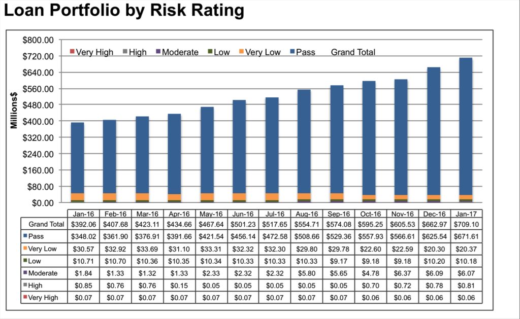
When one value on your chart is much higher than the rest, lower values on your chart might become unreadable. In this tutorial, you will learn a net way to deal with this kind of situations.
As you see, smaller values are almost indistinguishable due to chart scaling to show all values together.
We want to show all values together in the same chart too, but we also want them to be clearly understandable. Therefore, we have to crop this towering value to make it scalable.
To achieve our goal, we need to make a couple of little adjustments to our data set:
- Add 3 columns next to our original data. First column values will be the same for each series except the one with the high value. Give it a value just a little higher than the second higher value.
- Second and third columns will have “=NA()” as values for all series except the one with the high value. For second column, give it a value that will create a gap. And for third column, give it a little bigger value but not bigger than the first column value.
- Insert a stacked column chart by selecting whole data, than uncheck “Production” series from your source list.
- Your chart is supposed to look like the one in the picture below.
- Now we are going to format this chart to mate it look like the one below:
Here are the formatting I made on my chart:
- Add a chart title.
- Change color of the third column value on the chart to match the color of other series.
- Change fill of the second column value on the chart as pattern fill. Select vertical lines as pattern.
- Add labels for the first column values and move them above the bars.
- Add a label to the top of he longest series as a test box and write the original high value in it.
This is an easy way to create a chart with high and low values which shows all values together without compromising readability.
The health and wellness industry are thriving, and supplement brands are at the forefront of this growth. But how do these brands stand out in a crowded marketplace and build consumer trust? The secret lies in strategic marketing.
From leveraging the power of search engine optimization (SEO) to forming authentic connections through influencers, successful supplement brands use a mix of tactics to capture attention and convert interest into sales. Here’s a closer look at how these strategies work and what you can learn from them.
The Power of SEO in Driving Organic Traffic
Search engine optimization (SEO) is one of the most cost-effective ways to attract customers to your website. By optimizing your site for specific keywords like “best protein powder” or “natural vitamin D supplements,” or “cjc-1295 dac 10mg”you can rank higher on search engine results pages (SERPs). This helps drive organic traffic, bringing potential buyers directly to your virtual doorstep.
Take Garden of Life, for instance. This supplement brand has built a highly effective SEO strategy by publishing blog content that answers health-related questions consumers often search for. Articles like “The Benefits of Probiotics” educate consumers and improve the brand’s visibility on Google. By providing helpful, keyword-optimized content, Garden of Life strengthens its credibility while driving traffic to its site.
The first step for brands looking to boost their SEO is conducting thorough keyword research using tools like Google Keyword Planner or SEMrush. Once you’ve identified high-impact keywords, optimize your website’s meta titles, descriptions, and blog posts. Don’t forget to focus on technical SEO as well, make sure your site is fast, mobile-friendly, and easy to navigate.
Building Trust Through Influencer Marketing
Influencers have become a huge force in the supplement market. Why? People trust influencers. When a fitness trainer or wellness advocate recommends a product, their followers are likelier to believe it’s worth trying. Influencers bridge the gap between brands and consumers, offering a sense of authenticity that traditional ads often lack.
Consider Athletic Greens, a greens powder brand that’s mastered the art of influencer marketing. The brand has built significant credibility by partnering with popular podcasters, fitness enthusiasts, and lifestyle influencers. These partnerships often involve honest product reviews, testimonial-style posts, and discount codes, which excite consumers to try the product.
Finding someone whose values align with your brand is the key to effective influencer marketing. Micro-influencers, who typically have between 10,000 and 100,000 followers, can offer higher engagement rates than celebrity influencers. For example, a yoga instructor with a small but loyal following may create a more genuine connection with your target audience than a world-famous athlete.

Content Marketing That Educates and Converts
Content marketing goes hand in hand with SEO but deserves its spotlight. A well-crafted blog, eBook, or video can build brand authority and nurture leads. The key is to provide value to your audience.
For example, brands like NOW Foods publish well-researched guides on topics like “How to Choose the Right Supplements for Your Goals.” This establishes NOW Foods as an authority and helps consumers make informed decisions, earning their trust in the long run.
Beyond blogs and guides, long-form video content can showcase how your products fit into consumers’ lives. Recipe videos featuring protein powders or step-by-step tutorials on creating a supplement routine can add an extra layer of engagement. Visual content, such as infographics and branded animations, can also make more complex scientific information—like the benefits of omega-3 fatty acids—digestible and shareable for your audience.
Leveraging Email Marketing for Retention and Upsells
Email marketing remains a vital tool for supplement brands. It’s not just about acquiring new customers; it’s about keeping existing customers engaged and loyal. Emails allow you to promote seasonal sales, share valuable health tips, and introduce new products.
Take Ritual, a subscription-based supplement brand. Ritual creates personalized emails catering to users’ specific health goals. They send regular updates, friendly reminders about subscription renewals, and educational content about what goes into their vitamins. This nurturing approach makes customers feel like more than just a transaction.
To get started with email marketing, invest in tools like Mailchimp or Klaviyo to create automated campaigns. Always segment your email lists to send the right message to the right audience. For example, customers who recently bought a pre-workout supplement might appreciate tips on optimizing their fitness routines.
Social Media Advertising to Broaden Reach
Social media platforms like Instagram, Facebook, and TikTok provide fertile ground for advertising supplement goods. Facebook ads allow you to target users based on their interests, while Instagram Stories can use eye-catching visuals to highlight your product. TikTok, on the other hand, provides opportunities to go viral with creative, relatable content.
OLLY, a vitamin brand known for its colorful packaging, has expertly used Instagram to showcase its playful brand personality. Their mix of vibrant visuals, customer testimonials, and educational posts create an engaging presence that attracts new buyers daily.
For effective social media advertising, experiment with formats like carousel ads, allowing you to feature multiple products simultaneously. Use user-generated content (UGC) to amplify social proof and be sure to monitor performance metrics to tweak campaigns as needed.

Pivot tables are one of the most powerful tools in Excel, enabling data analysts and business owners to organize and summarize large datasets into meaningful insights. However, the grouping of fields within pivot tables can sometimes limit the depth and flexibility of analysis. Knowing how to ungroup fields when necessary can unlock new analytical opportunities and improve decision-making.
This guide explains what grouped and ungrouped pivot table fields are, demonstrates how to ungroup them in Excel step by step, and provides real-world scenarios where ungrouping fields can transform your analysis. Additionally, you’ll find tips for efficiently using pivot tables, ensuring accuracy in your business insights.
What Are Pivot Table Fields and Why Are They Grouped?
Pivot tables are designed to summarize, analyze, and present data in a way that simplifies decision-making. They allow users to group and aggregate data into meaningful categories. For example, sales data can be grouped by years, months, or regions to provide a high-level overview.
A grouped field in a pivot table is when Excel combines values into categories. For instance, if you have transactional dates, Excel might automatically group them into months or quarters. While grouping can simplify the presentation, it can sometimes hide granular details that are critical for certain analyses.
An ungrouped field, on the other hand, retains the raw dataset without aggregation. This offers more flexibility, particularly when analyzing each data point or creating custom groupings suited to your specific needs.
Why Ungrouping Pivot Table Fields May Be Necessary
While grouping provides clarity, it can restrict the ability to perform detailed data segmentation. Here are some situations where ungrouping pivot table fields is beneficial:
- Detailed trend analysis: If examining daily instead of monthly trends, ungrouped data offers greater granularity.
- Customized grouping: Ungrouping fields enables analysts to create custom categories that better reflect unique business needs.
- Avoiding data distortion: Aggregated groups may obscure unusual but important data points, such as outliers or spikes.
By ungrouping, you regain control of the data and can tailor it precisely to the goals of your analysis.
How to Ungroup Pivot Table Fields in Excel
Ungrouping pivot table fields in Excel is straightforward. Follow these steps to fine-tune your data presentation and analysis:
Step 1: Open Your Workbook and Select the Pivot Table
Open the Excel workbook that contains your pivot table. Click anywhere within the pivot table to activate the “PivotTable Analyze” menu on the ribbon.
Step 2: Identify the Grouped Field
Determine which field you want to ungroup. This could be a specific date field grouped into months or quarters, or numeric data grouped into ranges.
Step 3: Ungroup the Field
- Click on any cell within the grouped field.
- Navigate to the ribbon and select the “PivotTable Analyze” tab (called “Analyze” in older Excel versions).
- Click “Ungroup” in the Group section of the ribbon. Alternatively, right-click on the grouped field and choose “Ungroup” from the dropdown menu.
Step 4: Verify Your Data
After ungrouping, the field will display the individual data points instead of categories. Review the pivot table to ensure it reflects the intended changes.
Step 5: Refresh Your Pivot Table (if necessary)
If working with dynamic data sources, refresh the pivot table to apply the ungrouping to all relevant data. To do this, right-click anywhere in the table and select “Refresh.”
That’s it! Your grouped field is now ungrouped, giving you the precision you need for your analysis.
Real-World Examples of Ungrouping Pivot Table Fields
To understand the value of ungrouping fields, consider these scenarios where it can enhance analysis and decision-making:
- Sales Trends
A retail company wants to analyze sales performance by day rather than by month to identify precise dates of promotions or product launches that led to spikes in sales. Ungrouping the date field provides the needed granularity.
- Revenue Analysis by Region
A business owner initially groups revenue data by state to get an overview but decides to ungroup it to pinpoint revenue from individual cities for targeted marketing campaigns.
- Inventory Review
A supply chain manager grouped product stock by range (e.g., 1-10, 11-20) but needs to ungroup it to evaluate the specific inventory levels of individual items and plan reorders more effectively.
These scenarios demonstrate how ungrouping pivot table fields can help tailor analysis to specific goals and contexts.
Best Practices for Working with Pivot Tables
For data analysts and business owners, efficiency and accuracy are crucial when using pivot tables. Follow these expert tips to make the most out of your pivot table analysis:
1. Plan Your Analysis Goals Before Grouping or Ungrouping
Define what insights you need to extract from the data. This helps determine whether to group or ungroup fields.
2. Use Clear Naming Conventions
Rename fields and group labels for clarity. Descriptive names such as “Q1 Sales” or “East Coast Revenue” make pivot tables easier to read and interpret.
3. Leverage Filters for Deeper Analysis
Use built-in pivot table filters to focus on specific data subsets without having to ungroup unnecessarily.
4. Keep a Copy of the Original Data
Before ungrouping, always retain a backup of the original pivot table. This ensures you can revert to the earlier format if needed.
5. Refresh Your Data Regularly
Ensure your pivot table always reflects the latest data by refreshing it after making changes or ungrouping fields.
6. Explore Advanced Customization
Combine ungrouped data with calculated fields or custom sorting to unlock deeper insights tailored to your business needs.
Unlock Better Insights by Ungrouping Pivot Table Fields
Ungrouping pivot table fields in Excel provides data analysts and business owners with the flexibility to perform more detailed and tailored analyses. By understanding when and how to ungroup fields, you gain greater control over your data, enabling improved decision-making and more precise insights.
Whether you’re tracking sales trends, analyzing regional performance, or optimizing inventory, mastering this skill ensures your pivot tables work for you—not the other way around.
Are you ready to start making better use of your data? Open Excel, ungroup those fields, and take your data analysis to the next level today!
Meta Data
Meta title: How to Ungroup Pivot Table Fields in Excel
Meta description: Master ungrouping pivot table fields in Excel. Enhance your data analysis and make tailored decisions with this simple step-by-step guide.

Would you like to show progress on a KPI by putting a nice progress bar into your report? In this tutorial I’ll show you a very easy way of making a progress bar chart.
This chart too is a version of a thermometer chart with two single value data series. It is basically same chart as self filling chart. Only this is a bar chart instead of a column chart. Idea is basic, while one series is static, other will be dynamic, changing as we input data. By adding a label with percentage, we will have a progress bar chart.
We need a total cell that gets the sum of values from a list. And a cell that will contain a target value for comparison. When this part is done we need a simple addition for percentage part.
total% is equal to total/target (formatted as percentage), target% is equal to 1 (formatted as percentage).
Now select total% cells and insert a bar chart. Then select the chart and access “select chart data” from right-click menu. Here add a series (select target% for name and 100% as value). At this point you will have a bar chart with two data series.
Click on the total series and format it:
- fill: solid(blue)
- add white and bold label (inside end)
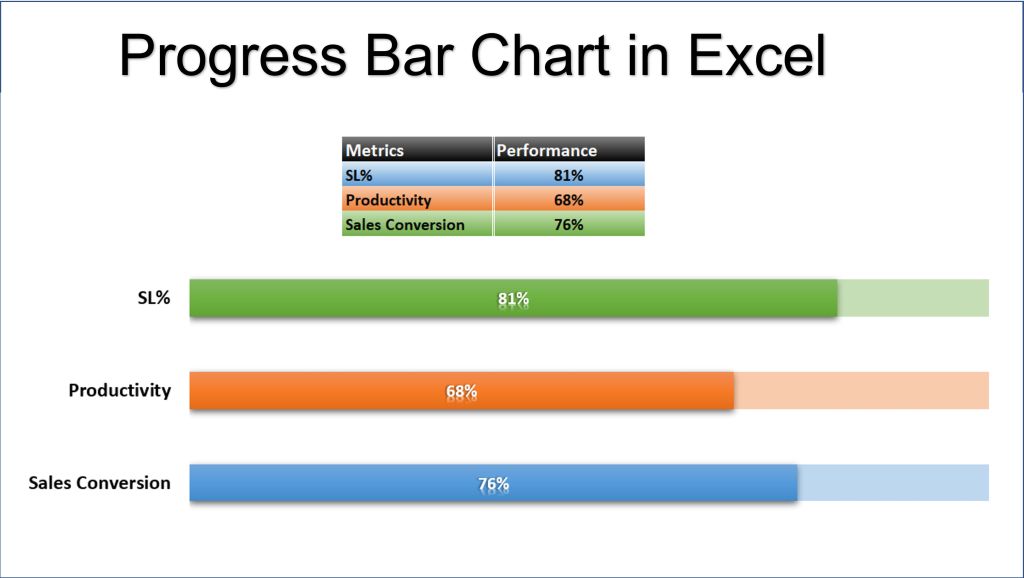
Click on the target series and format it:
- fill: no fill
- border: thick blue)
- Set series overlap to 100%.
Now you established progress bar chart. Remove any legend, axis, etc. and you are done.
-
 Education11 months ago
Excel Sunburst Chart
-
 Education1 year ago
Fix Microsoft Excel Error – PivotTable Field Name Is Not Valid
-

 Excel for Business8 months ago
Interactive Excel KPI Dashboard
-

 Education12 months ago
Positive Negative Bar Chart
-

 Education1 year ago
Excel Gantt Chart (Conditional Formatting)
-

 Excel for Business1 year ago
Mastering Chart Elements in Excel to Unlock Better Data Visualization
-

 Education12 months ago
Word Cloud Generators: The Modern Tool for Simplifying Data Visualization
-

 Education1 year ago
Streamlining Election Vote Counting with an Excel Election Template