Education
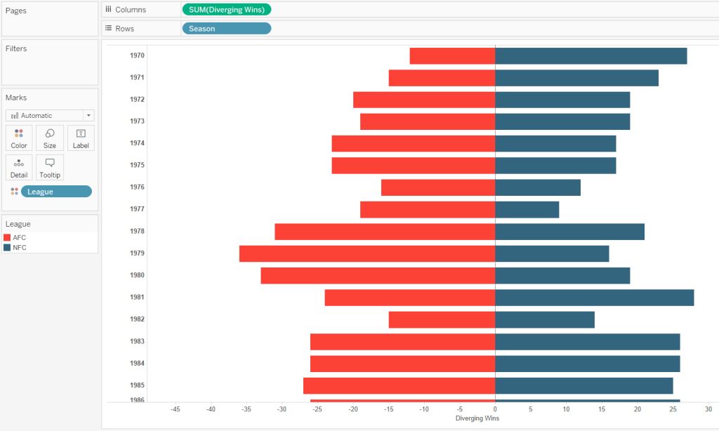
Positive Negative Bar Chart

Data visualization is essential for anyone working with data. Among the numerous tools available, bar charts are a popular choice for presenting information clearly and effectively. But what happens when you need to compare both positive and negative values? That’s where positive-negative bar charts come in to elevate your visual storytelling.
This blog will walk you through the fundamentals of positive-negative bar charts, their unique benefits, and how to create them in Excel. Along the way, we’ll explore best practices to ensure your charts are both visually appealing and easy to interpret while seamlessly integrating them into real-world applications.
What Are Positive-Negative Bar Charts?
Positive-negative bar charts, also known as diverging bar charts, are a specialized form of bar charts that allow you to represent data with both positive and negative values on the same axis. Unlike traditional bar charts that typically focus on one dimension (positive values), these offer greater versatility by visually comparing opposing trends in a single, unified chart.
The Purpose Behind These Charts
The main goal of a positive-negative bar chart is to illustrate contrast. For instance, they are great for displaying profits vs. losses, growth vs. decline, or any other contrasting pair of metrics. They place positive values above the baseline and negative values below it, providing an instantly recognizable visual cue.
What Makes Them Different from Traditional Bar Charts
One of the notable distinctions lies in their use of directionality. A traditional bar chart only extends upward, but the diverging design of positive-negative charts tells two contrasting stories—whether gains and losses, pros versus cons, or in/outflows of resources.
When to Use Positive-Negative Bar Charts
These charts shine when you need to showcase datasets with varying directions or polarity. Some common examples of when to use them include analyzing financial performance, comparing survey results, or highlighting discrepancies in resource management.
How to Create a Positive-Negative Bar Chart in Excel
If you need a diverging bar chart fast, look no further than Excel. This widely used tool simplifies the process and lets you customize your charts with ease. Follow these simple steps to get started.
Step 1: Prepare Your Data
Create two columns in your Excel sheet—one for positive values and one for negative values. Ensure your data is precise and well-organized, as this will directly affect the chart’s clarity.
Step 2: Insert a Bar Chart
Highlight your data, then go to the “Insert” tab in Excel, and select the “Bar Chart” option. From there, choose the “Clustered Bar Chart.” This will serve as the base for your positive-negative bar chart.
Step 3: Format and Refine
To turn your basic chart into a positive-negative bar chart, plot one series of data (e.g., the positive values) as it is, and make the other (negative values) stacked bars formatted below the baseline. To improve clarity, adjust colors—use green for positive and red for negative, or any other contrasting hues.
Finally, add clear, concise data labels and alter axis labels for precision. Use a legend if your chart includes multiple metrics.
Step 4: Add Final Enhancements
Focus on aesthetics while ensuring legibility. Use consistent fonts, avoid cluttered elements, and consider gridlines to improve comparisons. The cleaner the chart, the easier it is for your audience to interpret it.
Best Practices for Analyzing Data with Positive-Negative Bar Charts
Your chart is only as effective as your ability to analyze it. Here are some best practices for ensuring you accurately interpret the data presented.
Interpreting Direction and Magnitude
The direction of bars tells whether the value is positive or negative, but their magnitude shows the degree of impact. Make sure your audience understands both these aspects so that they can draw meaningful conclusions.
Comparing Positive and Negative Values
When analyzing data, it’s critical to focus on both similarities and differences between positive and negative values. For example, look for trends where spikes in one category directly correlate to dips in the other.
Highlighting Trends and Outliers
Spotting patterns is another strength of these charts. Any abrupt changes or unusually high/low values should immediately catch the eye and prompt further analysis. Outliers, in particular, offer valuable insights that might be missed in traditional reports.
Real-World Applications
Positive-negative bar charts prove extremely useful in industries like finance, marketing, and logistics.
Financial Performance Analysis
Businesses frequently use these charts for profit-and-loss statements, showing how net income or expenses have fluctuated over time or across departments.
Marketing Survey Results
When handling survey responses, diverging bar charts can compare how evenly customers favor or disfavor specific services or products, highlighting areas for business improvement.
Logistics and Supply Chain
They can also chart in-flows like inventory received versus out-flows like items shipped, ensuring balance and preventing potential bottlenecks.
Effective SEO and Traffic Tips
Targeting the right keywords and promoting data visualization content through channels like LinkedIn or forums for Excel users can boost your reach. Include popular search terms such as “how to make positive negative bar charts,” “top Excel charts for visualization,” or even “diverging bar visualization techniques.”
Crafting an Eye-Catching Meta Description
Optimize your post with clear, concise meta descriptions. For example, this blog’s meta could be, “Learn how to create and analyze positive-negative bar charts in Excel. Master practical tips for better data visualization strategies.”
Promoting your blog across social media platforms and online communities can also drive targeted traffic. Use professional forums to engage your audience with content that answers their specific pain points.
Why Positive-Negative Bar Charts Deserve a Place in Your Toolkit
Positive-negative bar charts are an extremely versatile tool in any analyst’s arsenal. They offer unique insights into contrasting trends and provide a visual approach to understanding complex datasets.
Whether you’re building a financial report, analyzing marketing data, or streamlining logistics, these charts make the process easier, faster, and more impactful.
For Excel users and IT professionals keen on improving their data visualization skill set, learning to use tools like these is crucial. Try creating your own positive-negative bar chart today and watch how it transforms your ability to communicate data!
The health and wellness industry are thriving, and supplement brands are at the forefront of this growth. But how do these brands stand out in a crowded marketplace and build consumer trust? The secret lies in strategic marketing.
From leveraging the power of search engine optimization (SEO) to forming authentic connections through influencers, successful supplement brands use a mix of tactics to capture attention and convert interest into sales. Here’s a closer look at how these strategies work and what you can learn from them.
The Power of SEO in Driving Organic Traffic
Search engine optimization (SEO) is one of the most cost-effective ways to attract customers to your website. By optimizing your site for specific keywords like “best protein powder” or “natural vitamin D supplements,” or “cjc-1295 dac 10mg”you can rank higher on search engine results pages (SERPs). This helps drive organic traffic, bringing potential buyers directly to your virtual doorstep.
Take Garden of Life, for instance. This supplement brand has built a highly effective SEO strategy by publishing blog content that answers health-related questions consumers often search for. Articles like “The Benefits of Probiotics” educate consumers and improve the brand’s visibility on Google. By providing helpful, keyword-optimized content, Garden of Life strengthens its credibility while driving traffic to its site.
The first step for brands looking to boost their SEO is conducting thorough keyword research using tools like Google Keyword Planner or SEMrush. Once you’ve identified high-impact keywords, optimize your website’s meta titles, descriptions, and blog posts. Don’t forget to focus on technical SEO as well, make sure your site is fast, mobile-friendly, and easy to navigate.
Building Trust Through Influencer Marketing
Influencers have become a huge force in the supplement market. Why? People trust influencers. When a fitness trainer or wellness advocate recommends a product, their followers are likelier to believe it’s worth trying. Influencers bridge the gap between brands and consumers, offering a sense of authenticity that traditional ads often lack.
Consider Athletic Greens, a greens powder brand that’s mastered the art of influencer marketing. The brand has built significant credibility by partnering with popular podcasters, fitness enthusiasts, and lifestyle influencers. These partnerships often involve honest product reviews, testimonial-style posts, and discount codes, which excite consumers to try the product.
Finding someone whose values align with your brand is the key to effective influencer marketing. Micro-influencers, who typically have between 10,000 and 100,000 followers, can offer higher engagement rates than celebrity influencers. For example, a yoga instructor with a small but loyal following may create a more genuine connection with your target audience than a world-famous athlete.

Content Marketing That Educates and Converts
Content marketing goes hand in hand with SEO but deserves its spotlight. A well-crafted blog, eBook, or video can build brand authority and nurture leads. The key is to provide value to your audience.
For example, brands like NOW Foods publish well-researched guides on topics like “How to Choose the Right Supplements for Your Goals.” This establishes NOW Foods as an authority and helps consumers make informed decisions, earning their trust in the long run.
Beyond blogs and guides, long-form video content can showcase how your products fit into consumers’ lives. Recipe videos featuring protein powders or step-by-step tutorials on creating a supplement routine can add an extra layer of engagement. Visual content, such as infographics and branded animations, can also make more complex scientific information—like the benefits of omega-3 fatty acids—digestible and shareable for your audience.
Leveraging Email Marketing for Retention and Upsells
Email marketing remains a vital tool for supplement brands. It’s not just about acquiring new customers; it’s about keeping existing customers engaged and loyal. Emails allow you to promote seasonal sales, share valuable health tips, and introduce new products.
Take Ritual, a subscription-based supplement brand. Ritual creates personalized emails catering to users’ specific health goals. They send regular updates, friendly reminders about subscription renewals, and educational content about what goes into their vitamins. This nurturing approach makes customers feel like more than just a transaction.
To get started with email marketing, invest in tools like Mailchimp or Klaviyo to create automated campaigns. Always segment your email lists to send the right message to the right audience. For example, customers who recently bought a pre-workout supplement might appreciate tips on optimizing their fitness routines.
Social Media Advertising to Broaden Reach
Social media platforms like Instagram, Facebook, and TikTok provide fertile ground for advertising supplement goods. Facebook ads allow you to target users based on their interests, while Instagram Stories can use eye-catching visuals to highlight your product. TikTok, on the other hand, provides opportunities to go viral with creative, relatable content.
OLLY, a vitamin brand known for its colorful packaging, has expertly used Instagram to showcase its playful brand personality. Their mix of vibrant visuals, customer testimonials, and educational posts create an engaging presence that attracts new buyers daily.
For effective social media advertising, experiment with formats like carousel ads, allowing you to feature multiple products simultaneously. Use user-generated content (UGC) to amplify social proof and be sure to monitor performance metrics to tweak campaigns as needed.

Pivot tables are one of the most powerful tools in Excel, enabling data analysts and business owners to organize and summarize large datasets into meaningful insights. However, the grouping of fields within pivot tables can sometimes limit the depth and flexibility of analysis. Knowing how to ungroup fields when necessary can unlock new analytical opportunities and improve decision-making.
This guide explains what grouped and ungrouped pivot table fields are, demonstrates how to ungroup them in Excel step by step, and provides real-world scenarios where ungrouping fields can transform your analysis. Additionally, you’ll find tips for efficiently using pivot tables, ensuring accuracy in your business insights.
What Are Pivot Table Fields and Why Are They Grouped?
Pivot tables are designed to summarize, analyze, and present data in a way that simplifies decision-making. They allow users to group and aggregate data into meaningful categories. For example, sales data can be grouped by years, months, or regions to provide a high-level overview.
A grouped field in a pivot table is when Excel combines values into categories. For instance, if you have transactional dates, Excel might automatically group them into months or quarters. While grouping can simplify the presentation, it can sometimes hide granular details that are critical for certain analyses.
An ungrouped field, on the other hand, retains the raw dataset without aggregation. This offers more flexibility, particularly when analyzing each data point or creating custom groupings suited to your specific needs.
Why Ungrouping Pivot Table Fields May Be Necessary
While grouping provides clarity, it can restrict the ability to perform detailed data segmentation. Here are some situations where ungrouping pivot table fields is beneficial:
- Detailed trend analysis: If examining daily instead of monthly trends, ungrouped data offers greater granularity.
- Customized grouping: Ungrouping fields enables analysts to create custom categories that better reflect unique business needs.
- Avoiding data distortion: Aggregated groups may obscure unusual but important data points, such as outliers or spikes.
By ungrouping, you regain control of the data and can tailor it precisely to the goals of your analysis.
How to Ungroup Pivot Table Fields in Excel
Ungrouping pivot table fields in Excel is straightforward. Follow these steps to fine-tune your data presentation and analysis:
Step 1: Open Your Workbook and Select the Pivot Table
Open the Excel workbook that contains your pivot table. Click anywhere within the pivot table to activate the “PivotTable Analyze” menu on the ribbon.
Step 2: Identify the Grouped Field
Determine which field you want to ungroup. This could be a specific date field grouped into months or quarters, or numeric data grouped into ranges.
Step 3: Ungroup the Field
- Click on any cell within the grouped field.
- Navigate to the ribbon and select the “PivotTable Analyze” tab (called “Analyze” in older Excel versions).
- Click “Ungroup” in the Group section of the ribbon. Alternatively, right-click on the grouped field and choose “Ungroup” from the dropdown menu.
Step 4: Verify Your Data
After ungrouping, the field will display the individual data points instead of categories. Review the pivot table to ensure it reflects the intended changes.
Step 5: Refresh Your Pivot Table (if necessary)
If working with dynamic data sources, refresh the pivot table to apply the ungrouping to all relevant data. To do this, right-click anywhere in the table and select “Refresh.”
That’s it! Your grouped field is now ungrouped, giving you the precision you need for your analysis.
Real-World Examples of Ungrouping Pivot Table Fields
To understand the value of ungrouping fields, consider these scenarios where it can enhance analysis and decision-making:
- Sales Trends
A retail company wants to analyze sales performance by day rather than by month to identify precise dates of promotions or product launches that led to spikes in sales. Ungrouping the date field provides the needed granularity.
- Revenue Analysis by Region
A business owner initially groups revenue data by state to get an overview but decides to ungroup it to pinpoint revenue from individual cities for targeted marketing campaigns.
- Inventory Review
A supply chain manager grouped product stock by range (e.g., 1-10, 11-20) but needs to ungroup it to evaluate the specific inventory levels of individual items and plan reorders more effectively.
These scenarios demonstrate how ungrouping pivot table fields can help tailor analysis to specific goals and contexts.
Best Practices for Working with Pivot Tables
For data analysts and business owners, efficiency and accuracy are crucial when using pivot tables. Follow these expert tips to make the most out of your pivot table analysis:
1. Plan Your Analysis Goals Before Grouping or Ungrouping
Define what insights you need to extract from the data. This helps determine whether to group or ungroup fields.
2. Use Clear Naming Conventions
Rename fields and group labels for clarity. Descriptive names such as “Q1 Sales” or “East Coast Revenue” make pivot tables easier to read and interpret.
3. Leverage Filters for Deeper Analysis
Use built-in pivot table filters to focus on specific data subsets without having to ungroup unnecessarily.
4. Keep a Copy of the Original Data
Before ungrouping, always retain a backup of the original pivot table. This ensures you can revert to the earlier format if needed.
5. Refresh Your Data Regularly
Ensure your pivot table always reflects the latest data by refreshing it after making changes or ungrouping fields.
6. Explore Advanced Customization
Combine ungrouped data with calculated fields or custom sorting to unlock deeper insights tailored to your business needs.
Unlock Better Insights by Ungrouping Pivot Table Fields
Ungrouping pivot table fields in Excel provides data analysts and business owners with the flexibility to perform more detailed and tailored analyses. By understanding when and how to ungroup fields, you gain greater control over your data, enabling improved decision-making and more precise insights.
Whether you’re tracking sales trends, analyzing regional performance, or optimizing inventory, mastering this skill ensures your pivot tables work for you—not the other way around.
Are you ready to start making better use of your data? Open Excel, ungroup those fields, and take your data analysis to the next level today!
Meta Data
Meta title: How to Ungroup Pivot Table Fields in Excel
Meta description: Master ungrouping pivot table fields in Excel. Enhance your data analysis and make tailored decisions with this simple step-by-step guide.
When one value on your chart is much higher than the rest, lower values on your chart might become unreadable. In this tutorial, you will learn a net way to deal with this kind of situations.
As you see, smaller values are almost indistinguishable due to chart scaling to show all values together.
We want to show all values together in the same chart too, but we also want them to be clearly understandable. Therefore, we have to crop this towering value to make it scalable.
To achieve our goal, we need to make a couple of little adjustments to our data set:
- Add 3 columns next to our original data. First column values will be the same for each series except the one with the high value. Give it a value just a little higher than the second higher value.
- Second and third columns will have “=NA()” as values for all series except the one with the high value. For second column, give it a value that will create a gap. And for third column, give it a little bigger value but not bigger than the first column value.
- Insert a stacked column chart by selecting whole data, than uncheck “Production” series from your source list.
- Your chart is supposed to look like the one in the picture below.
- Now we are going to format this chart to mate it look like the one below:
Here are the formatting I made on my chart:
- Add a chart title.
- Change color of the third column value on the chart to match the color of other series.
- Change fill of the second column value on the chart as pattern fill. Select vertical lines as pattern.
- Add labels for the first column values and move them above the bars.
- Add a label to the top of he longest series as a test box and write the original high value in it.
This is an easy way to create a chart with high and low values which shows all values together without compromising readability.
-
 Education11 months ago
Excel Sunburst Chart
-
 Education1 year ago
Fix Microsoft Excel Error – PivotTable Field Name Is Not Valid
-

 Excel for Business8 months ago
Interactive Excel KPI Dashboard
-

 Education1 year ago
Excel Gantt Chart (Conditional Formatting)
-

 Excel for Business1 year ago
Mastering Chart Elements in Excel to Unlock Better Data Visualization
-

 Education12 months ago
Word Cloud Generators: The Modern Tool for Simplifying Data Visualization
-

 Education1 year ago
Streamlining Election Vote Counting with an Excel Election Template
-

 Excel for Business8 months ago
How to Sort Data Horizontally in Excel